


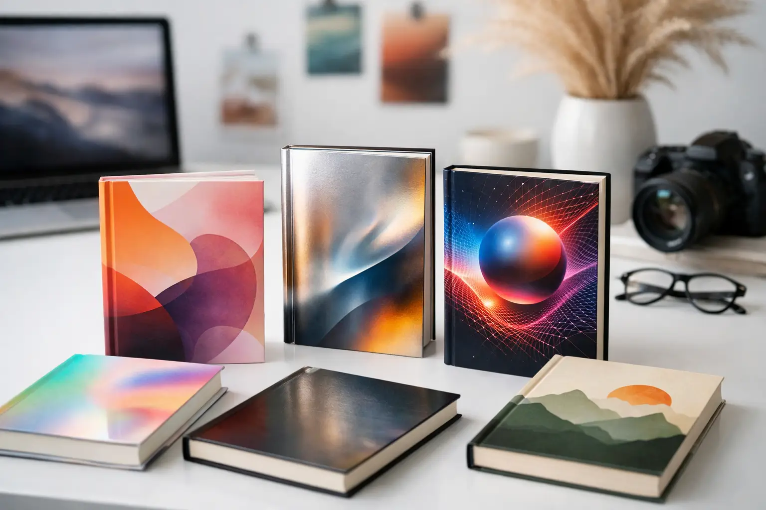
A cover that looked current two years ago can already feel slow on a retail grid. That is what makes book cover design trends 2026 worth watching closely, especially for self-published authors and small teams competing for attention in crowded digital storefronts.
The shift is not about chasing novelty for its own sake. It is about making faster visual decisions that read clearly at thumbnail size, signal genre in seconds, and still feel polished enough to support pricing, ads, and series growth. For indie publishing, that balance matters more than ever.
What book cover design trends 2026 are really responding to
Most cover trends are a reaction to where books are being discovered. In 2026, discovery continues to be shaped by small screens, fast scrolling, and ad-heavy environments. Readers often see a cover first as a tiny image, not a full print object in their hands.
That changes the design brief. Fine detail matters less unless it supports a strong first read. Hierarchy matters more. Contrast matters more. Typography matters more. Covers need to work in motion, in feeds, in online storefronts, and in print without becoming generic.
The other major factor is volume. More books are launching, more authors are building direct brands, and more series are competing within tightly defined niches. A cover now has to do two jobs at once. It needs to fit the market and stand out inside that market. Those goals can pull against each other, so the best 2026 work handles both with restraint.
The biggest visual shifts in book cover design trends 2026
Typography is doing more of the selling
Type is no longer just a label placed over artwork. In many categories, it is the artwork. Large, confident title treatment continues to dominate because it solves a practical problem: readability.
In thrillers and nonfiction, that often means condensed sans serif fonts with aggressive scale and tight spacing. In romance and upmarket fiction, type is becoming more expressive, but still controlled. Custom lettering, subtle distortion, and layered text effects are being used to add personality without damaging legibility.
The trade-off is obvious. Highly stylized typography can look premium, but if the title becomes hard to read at thumbnail size, the cover loses commercial strength. For most indie authors, readable type still wins.
Minimalism is staying, but it is getting sharper
Minimal covers are not going away. What is changing is the level of precision. The flat, generic minimalism that was common a few years ago is being replaced by covers with stronger focal points, more intentional spacing, and one or two memorable visual decisions.
That could mean a single symbol, a cropped image, or a bold color field with structured type. The key is control. Minimalism works when it feels deliberate, not empty. If the design looks stripped down because there was no clear concept, readers can spot that quickly.
This is especially relevant for business books, self-help, literary fiction, and some contemporary romance. In those categories, a clean cover can communicate confidence. But clean should not mean vague.
Texture is returning in digital-friendly ways
One interesting shift in book cover design trends 2026 is the use of tactile-looking surfaces. Grain, paper noise, ink bleed, soft halftones, and light distressing are showing up across genres. Not as clutter, but as depth.
This works because digital-first covers can otherwise feel too flat. Texture gives a design more presence without requiring complicated imagery. It also helps simple covers feel more finished.
The caution is that texture should support hierarchy, not compete with it. If overlays muddy the title or make a cover look dark and compressed online, the effect backfires. Good texture is noticeable second, not first.
Genre signaling is becoming more exact
Readers do judge by the cover. More accurately, they judge genre fit by the cover. In 2026, successful covers are leaning harder into recognizable category markers while trimming away mixed signals.
Fantasy is a good example. Covers are becoming cleaner in composition, but still rich in atmosphere. Romance is pushing stronger emotional coding through color, script choices, and illustration style. Mystery and suspense continue to rely on tension, contrast, and visual unease rather than overworked symbolism.
This does not mean every cover should look interchangeable. It means you should know which expectations need to be met before you start trying to be different. A cover that feels unique but miscategorized can hurt conversion.
Color is getting bolder, but not louder
Color palettes are moving toward stronger contrast and fewer muddy midtones. Deep blacks, clean creams, electric brights, and high-control duotones are appearing more often because they hold up well on screens.
At the same time, many covers are avoiding the oversaturated look that can feel cheap in online marketplaces. The stronger work uses one dominant color idea and builds around it. That might be a vivid accent on a neutral base or a full-field color paired with disciplined type.
This is where market context matters. A bold palette can help a debut title get attention, but it can also break series continuity or clash with genre expectations. For authors publishing multiple books, color strategy should be considered across the full catalog, not just one release.
Illustration keeps growing, but style matters more than ever
Illustrated covers remain strong, especially in romance, fantasy, young adult, and select nonfiction categories. What is changing is the illustration style. Readers are responding less to generic stock-style vector art and more to illustration systems with clear mood and point of view.
Flat cartoon approaches still work in some romance subgenres, but they are no longer a universal shortcut. Many covers are shifting toward more dimensional illustration, limited-palette scenes, hand-drawn accents, or hybrid artwork that combines photographic and illustrated elements.
For indie authors, this matters because illustration can quickly look trend-driven in the wrong way. If you choose an illustrated direction, it helps to ask a basic question: does this style reflect the tone of the book, or just a moment in the market?
AI influence is real, but polished design still wins
AI-generated imagery is affecting cover design, even when it is not visible as an obvious style. It is speeding up concept generation, mood exploration, and image experimentation. But it is also flooding the market with covers that look technically detailed and commercially weak.
The reason is simple. A cover is not just an image. It is a packaging system. Composition, title hierarchy, subtitle handling, author branding, spine logic, and print readiness still matter. A striking visual with poor typography is still a poor cover.
That is why software-based workflows are becoming more valuable. Authors and small teams need speed, but they also need structure. A tool like Cover Design App fits that need because it helps turn creative direction into a finished, market-ready cover instead of stopping at concept art.
What indie authors should actually do with these trends
Trend awareness is useful, but copying surface details usually leads to dated results. The smarter move is to filter trends through three questions.
First, what does your genre require readers to understand in one second? Second, what will still look current when your ads run six months after launch? Third, what can you execute cleanly without adding unnecessary complexity?
That practical filter matters because not every trend is worth adopting. A heavily textured literary look might be perfect for one title and completely wrong for a fast-paced business book. A minimalist cover might look premium in nonfiction and invisible in fantasy romance. Context decides.
If you are designing in-house, start with hierarchy before style. Make sure the title reads, the genre is clear, and the composition holds together at small size. Then refine color, texture, and imagery. That order prevents a lot of avoidable mistakes.
It also helps to test covers where they will actually live. A full-resolution design can look impressive on a large monitor and weak everywhere else. Shrink it down. Put it next to competing titles. If the main message disappears, the design needs more work.
The covers that will age best in 2026
The strongest covers next year will not be the busiest or the most experimental. They will be the ones that make quick decisions well. Clear typography. Strong contrast. Controlled texture. Intentional genre cues. Enough personality to feel distinct, but not so much that the market cannot place the book.
That is the practical center of book cover design trends 2026. The market is rewarding clarity with style, not style instead of clarity.
If you are publishing soon, the goal is not to look trendy. It is to look current, credible, and easy to choose when a reader gives you half a second of attention.